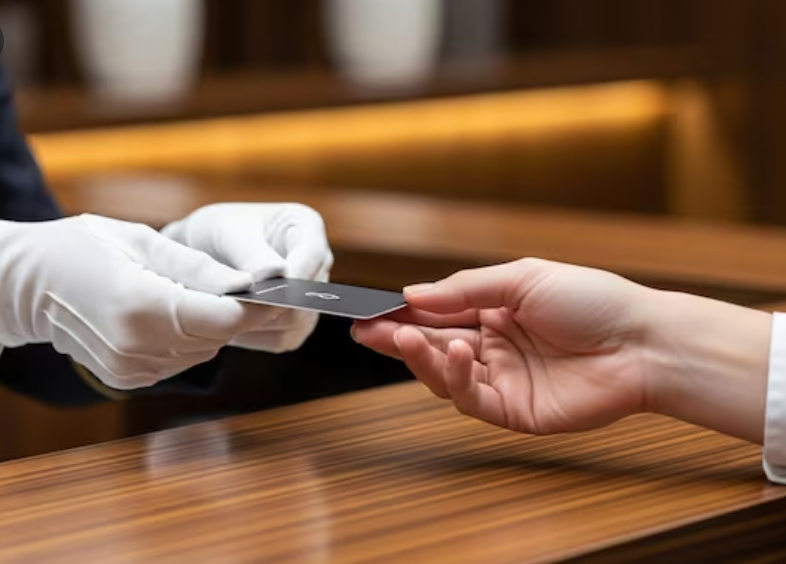

Paper key cards are becoming popular in resorts, motels, and hotels that want a cleaner and more eco-friendly option. Guests like how light and simple they feel. Staff like that they are easy to print and replace. But even with these benefits, many hotels still face issues because of poor card design.
Small design mistakes can confuse guests, slow down check-ins, and create long lines at the front desk. When guests struggle to use their paper hotel key cards, their stay starts with stress.
Many hotels try to fit too much text on the card. This makes the room number, Wi-Fi details, and instructions too small. Guests end up squinting or holding the card close to their face. In dim lighting, this becomes even harder.
Clear and large text helps every guest. It reduces questions at the front desk and makes check-in smoother.
Keep the most important information in big, easy-to-read letters. A clean design works better than a crowded one.
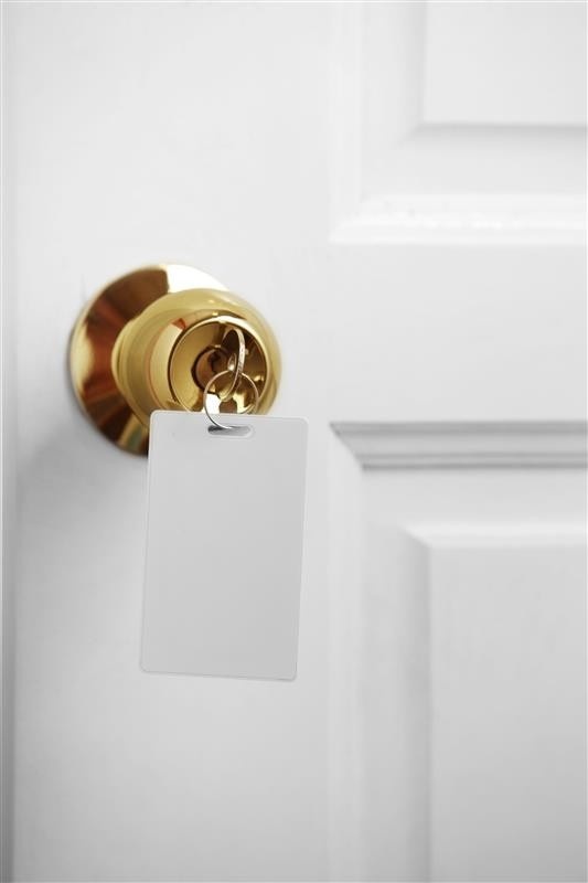
Some keycards place the room number in a corner or behind an icon. Guests flip the card again and again, hoping to spot it. This leads to confusion in hallways and elevators.
The room number should sit in a clear and obvious spot. It should be the first thing guests see when they look at the card.
If you want privacy, you can still display the number clearly while keeping the font simple.
Guests check in after long flights, long drives, or long meetings. They do not want to read tiny paragraphs. They want quick and simple steps.
Many hotels include instructions that are too long. Some add technical words that make the process harder than it should be.
You can help guests by using key phrases. Use simple words like “Tap,” “Insert,” or “Hold for one second.” These small choices reduce confusion instantly.
Bright colors look fun, but too many colors can distract guests. When every corner has a different color, the important details get lost.
Your paper hotel key cards will look more useful when you use two or three colors at most. Use color to highlight the room number, not to decorate every inch of the card.
Calm colors help guests find what they need faster.
Branding is important, but large logos often push room details into small corners. This makes the card look good in photos but less helpful in real life.
You can keep your logo on the card, but give guests the space they need. A small or centered logo still supports your brand without blocking the key information.
When guests can read the card quickly, they enjoy a smoother stay.
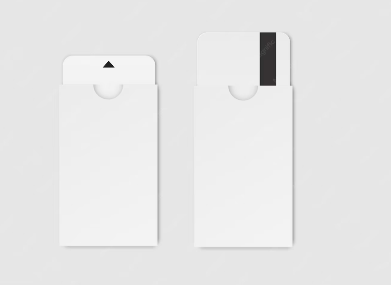
Mistake 6. The Back of the Card Is Empty
Many hotels only use the front side of the card. This wastes helpful space that could hold quick instructions, Wi-Fi info, directions to elevators, or service hours.
Using both sides keeps the front clean and the back practical. Guests feel supported when they see everything they need in one place.
This small change saves time for your staff because guests ask fewer questions.
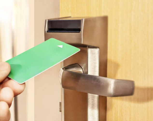
Paper key cards often work with tap or insert systems. When hotels do not show which side faces the sensor, guests guess. This leads to long pauses outside rooms and extra trips to the lobby.
A simple arrow or clear label helps guests understand how to use the card correctly. This avoids stress and reduces wear on the lock.
You can improve your card design with a few simple steps:
When guests feel confident using your paper hotel key cards, their first experience with your hotel becomes positive. A good design reduces confusion and makes your service look polished and thoughtful.
Why do guests get confused with paper hotel key cards?
Guests get confused when the text is too small, the room number is hard to find, or the instructions are not clear. These things make the card harder to use.
How can we make our paper hotel key cards easier to understand?
You can use larger text, simple instructions, and clear placement for the room number on your paper key card. A clean and simple card design helps guests right away.
Should we use both sides of the key card?
Yes. Using both sides of your key card gives you more space for room details, Wi-Fi info, and quick steps. This makes the card more helpful for guests.